7 Essential Tips for Designing Effective Outdoor Wall Signage
In today's visually-driven world, effective communication is crucial for any business or organization, especially when it comes to Outdoor Wall Signage. These signs not only convey important information but also create a lasting first impression on potential customers and visitors.
Designing Outdoor Wall Signage that captures attention while remaining functional is no small feat. With various factors to consider, such as visibility, readability, and overall design, it can be overwhelming to navigate the complexities of sign creation.
That’s why we’ve compiled seven essential tips that will guide you in crafting impactful Outdoor Wall Signage that stands out in any environment. Whether you're looking to enhance brand awareness or simply provide directions, these expert suggestions will ensure your signage serves its purpose effectively and aesthetically.
Choosing the Right Material for Durability and Aesthetics in Outdoor Signage
When designing outdoor wall signage, selecting the right material is crucial for ensuring both durability and aesthetic appeal. Weather-resistant materials such as aluminum and high-density urethane (HDU) are excellent options for outdoor use. Aluminum is lightweight, corrosion-resistant, and can withstand harsh weather conditions, making it ideal for long-lasting signage. HDU, on the other hand, offers versatility in shape and finish, allowing for intricate designs while providing robust resistance to moisture, UV rays, and temperature fluctuations.
Another important consideration is the finish of the material. A well-chosen finish not only enhances the visual appeal of the sign but also adds an extra layer of protection. For instance, applying a UV-resistant coating will help preserve the vibrancy of colors and graphics over time. Additionally, materials like composite wood can provide a natural aesthetic while being treated for durability against the elements. Ultimately, the right combination of material and finish will ensure that your outdoor wall signage remains attractive and functional, standing the test of time and outdoor conditions.
Incorporating Brand Colors and Fonts for Instant Recognition and Impact
When designing outdoor wall signage, one of the key aspects to consider is the incorporation of brand colors and fonts. These elements are not just decorative; they serve as vital tools for instant recognition and visual impact. Consistency in colors helps to reinforce brand identity and creates a cohesive look across all marketing materials. For instance, using bold, contrasting colors can enhance visibility, ensuring that your signage stands out in diverse weather conditions and lighting scenarios. Selecting a color palette that resonates with your brand’s message can evoke the desired emotions and create stronger connections with your audience.
Equally important is the choice of fonts. The typography you select should align with your brand’s personality—more playful fonts for casual brands and sleek, modern typography for corporate identities. Clear, legible fonts are essential for outdoor signage, as viewers may only have a few seconds to take in the information. By pairing your brand colors with the right font, you create a visually appealing sign that not only attracts attention but also communicates your message effectively. Striking the right balance between aesthetics and readability will lead to signage that leaves a lasting impression on passersby.
Maximizing Visibility: Effective Placement Strategies for Outdoor Signs
When designing outdoor wall signage, maximizing visibility is paramount. One key strategy is to carefully consider the placement of your signs. Signs positioned at eye level are more likely to capture attention, so aim for a height that ensures readability without obstruction. Avoid placing signs too high or too low, as this can hinder their effectiveness.
Another important tip is to account for the surrounding environment. Ensure your signage contrasts sufficiently with its background; bright colors against a muted backdrop can enhance visibility. Additionally, consider the direction of foot traffic and vehicle flow when deciding on placement. Positioning your signs where they naturally catch the eye of passersby will significantly increase their impact.
Utilizing
lighting can further enhance visibility, particularly in darker conditions. Incorporating illumination into your signage design can draw attention both day and night. Lastly, don’t forget to test visibility from various distances—what works for guests nearby may not be effective for those further away. By combining these strategies, you can create outdoor wall signage that truly stands out and communicates effectively.
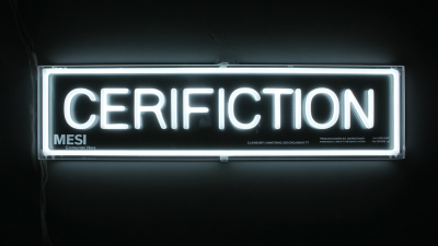
Utilizing Lighting to Enhance Readability and Attract Attention
When it comes to outdoor wall signage, effective lighting plays a crucial role in ensuring visibility and readability. According to a study by the Sign Research Foundation, illuminated signs can increase business visibility by up to 40%. This highlights the significance of strategic lighting designs not only to make the message clear but also to create a welcoming atmosphere. For instance, using LED lights not only enhances brightness but also offers energy efficiency, which is essential for outdoor setups.
Moreover, the clever use of lighting can attract attention during both day and night. The Outdoor Advertising Association of America (OAAA) reports that well-lit signs can increase foot traffic by an impressive 25%. Utilizing spotlights, backlighting, or even ambient lighting can create an inviting focal point, directing potential customers to your establishment. By adopting these effective lighting strategies, businesses can not only enhance their signage’s readability but also boost their overall branding and visibility in competitive outdoor environments.

Designing for Legibility: The Importance of Font Size and Contrast in Signage
When designing outdoor wall signage, legibility is paramount, and this hinges significantly on two factors: font size and contrast. According to a report by the Society for Experiential Graphic Design (SEGD), approximately 70% of people can recognize a brand from a distance of 150 feet or more when effective typography is utilized. This highlights the need to choose font sizes that can be easily read by passersby, particularly in urban environments where visual clutter can be an issue. Fonts should be sized appropriately to ensure that they grab attention without straining the viewer's eyes, ideally using a minimum of 6-inch letters for primary messages.
Contrast also plays a critical role in signage legibility. A study by the International Sign Association (ISA) revealed that signs with high contrast can enhance readability by up to 60%. This means that pairing light text on a dark background, or vice versa, not only draws attention but ensures that messages are conveyed quickly and effectively. As sunlight can wash out colors, it’s important to select colors that maintain their contrast in various lighting conditions. Thus, careful consideration of font size and contrast is not just an aesthetic choice, but a vital strategy in creating outdoor signage that communicates effectively and engages the audience.
7 Essential Tips for Designing Effective Outdoor Wall Signage
| Tip |
Description |
Recommended Font Size |
Contrast Ratio |
| Choose Readable Fonts |
Select simple, sans-serif fonts for maximum legibility. |
At least 10-12 pt for body text |
Minimum 4.5:1 for normal text |
| Use High Contrast Colors |
Ensure text color stands out against the background. |
12-14 pt for better visibility |
Minimum 7:1 for large text |
| Consider Viewing Distance |
Larger text is needed for signs viewed from far away. |
16-20 pt for distance viewing |
Ensure at least 5:1 contrast |
| Limit Text Content |
Keep messages short and simple for quick understanding. |
N/A |
N/A |
| Use Imagery Wisely |
Support the message with relevant images but avoid clutter. |
N/A |
N/A |
| Account for Lighting Conditions |
Consider how light affects visibility and adjust accordingly. |
N/A |
N/A |
| Test Your Signage |
Seek feedback on clarity and legibility before finalizing. |
N/A |
N/A |